As a regular contributor to the London-based infographic agency Infogr8, my duties included pitching data-driven stories and ideas for personal projects, data research, data mapping through the software Gliffy and making sure that the results and work was always in line with the clients goals.
Projects were commissioned by Carlsberg, Macmillan Cancer Support, YouGov, Selfridges, Nest, Axa, Scriptoria and Vuelio, among others. You can find some samples of the infographics I helped develop here (click to have a better look); most of them were private projects and protected with NDAs, however, so cannot be shared.


I have also provided several sets of data to publications either as stand-alone features or accompaniments to my stories.
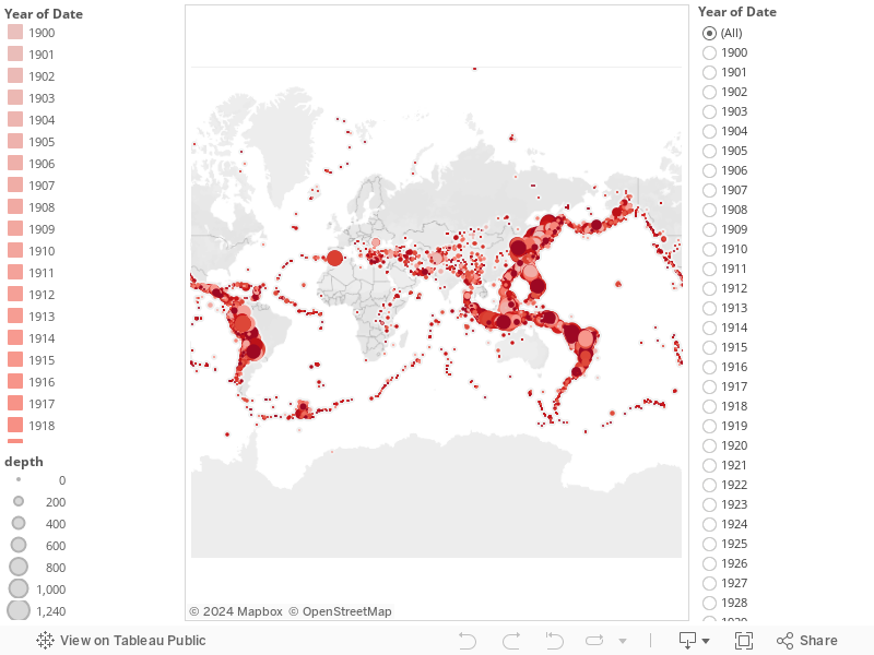
Where have the strongest and deepest earthquakes occurred from 1910 to 2014? Find out it with this data-visualization I created with Tableau Public.
Which Italian deputy is working the most at European Parliament? Find out with an interactive infographic that I helped create for La Stampa. Link is under the screenshot.

http://www.lastampa.it/medialab/webdoc/la-stampa-academy/europarlamentari
For La Stampa I also contributed to the dynamic infographic "Fatti di frasi fatte", which analyzes the most common, funniest Italian expressions and puts them together in a single game. Build your own "frase fatta"!

http://www.lastampa.it/fattidifrasifatte
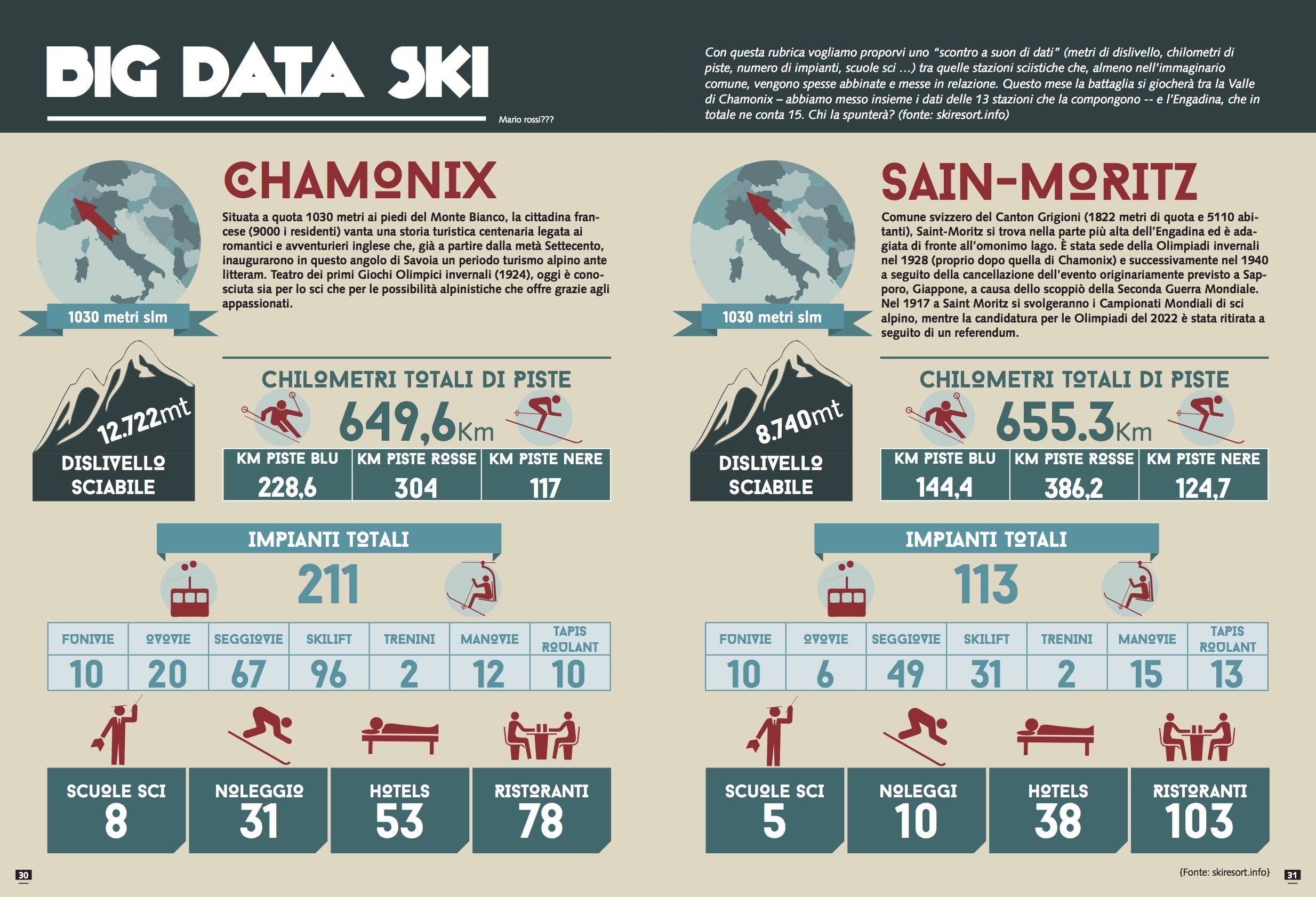
I contributed the data for this infographic of the French resort of Chamonix versus the Swiss one of Saint-Moritz.
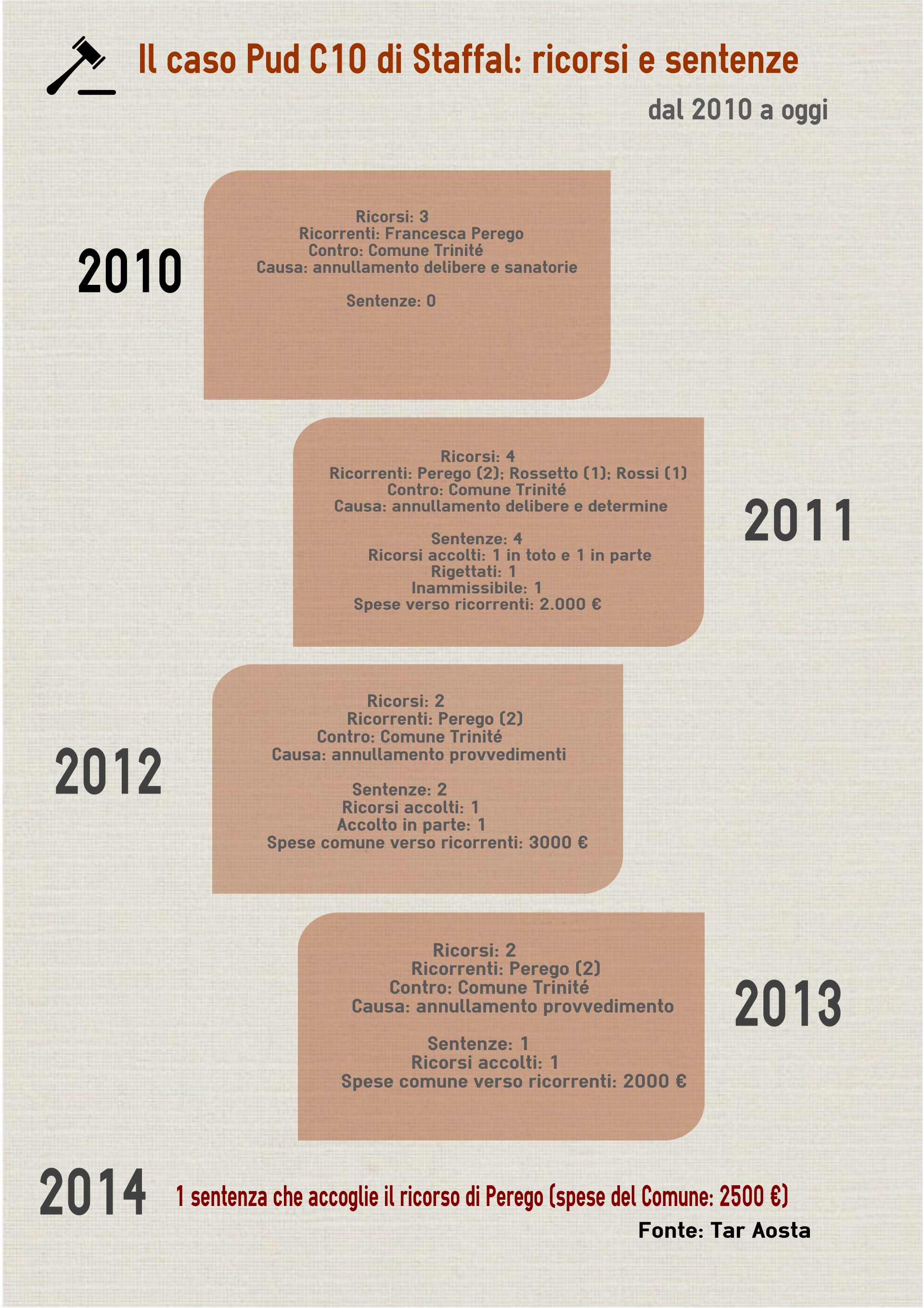
In this infographic that I drew myself, I analyzed the lawsuits against my hometown's administration (the village of Gressoney-La-Trinité) in the last 5 years. Very interesting results for a reporter and useful, easy-to-access data for readers and the public.